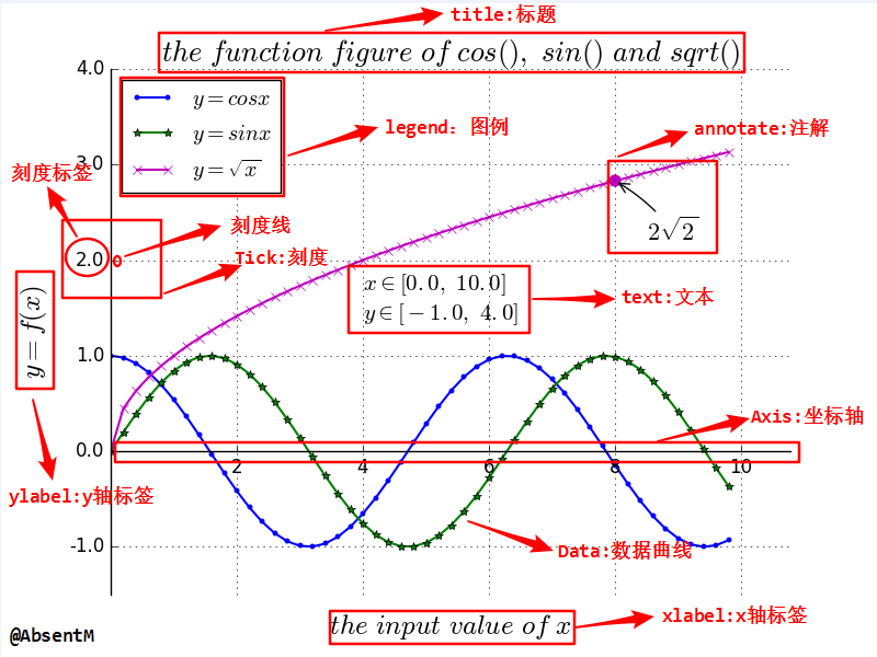
基础设置
|
|
示例
|
|
设置图片大小、质量
|
|

下载图片
|
|
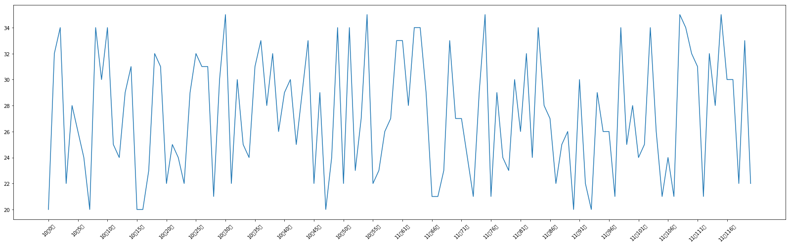
调整 X 或者 Y 轴上的刻度和显示内容
虽然指定了 x 轴和 y 轴对应点的关系,但是 x 轴和 y 轴的刻度并没有指定,如果默认的刻度不满足需求,我们可以进行更改
|
|
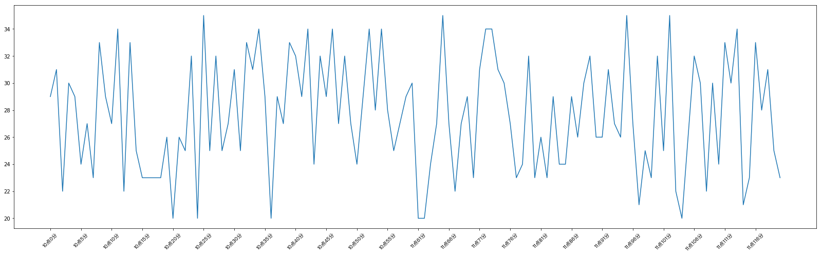
设置 x、y 轴刻度的别名、刻度方向
那么问题来了:
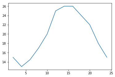
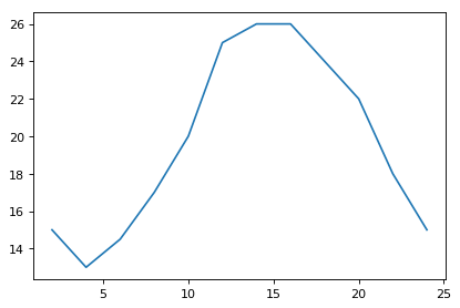
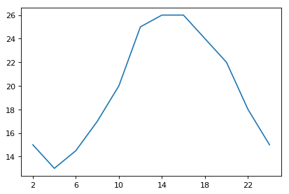
如果列表a表示10点到12点的每一分钟的气温,如何绘制折线图观察每分钟气温的变化情况?
a= [random.randint(20,35) for i in range(120)]
|
|
设置显示中文
matplotlib 默认不支持中文字符,因为默认的英文字体无法显示汉字
查看 linux/mac 下面支持的字体:fc-list 查看支持的字体fc-list :lang=zh 查看支持的中文(冒号前面有空格)
mac 下如果不支持该命令,需要安装
brew install fontconfig
那么问题来了:如何修改 matplotlib 的默认字体?
- 通过
matplotlib.rc可以修改,具体方法参见源码(windows/linux平台下可行) - 通过
matplotlib下的font_manager可以解决(windows/linux/mac平台下可行)
|
|
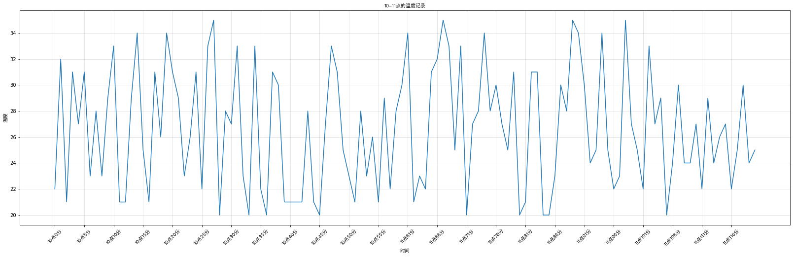
给图像添加描述信息
设置图的 title 和轴的 label,显示网格
|
|
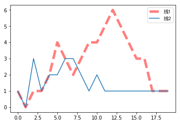
设置线条样式和图例位置
线条样式参数值
| 颜色字符(color) | 风格字符(linestyle) | 点样式(marker) |
|---|---|---|
r红色 |
- or solid 实线 |
. point |
g绿色 |
-- or dashed 虚线 |
, pixel |
g蓝色 |
-. or dashdot 点划线 |
o circle |
w白色 |
: or dotted 点虚线 |
v triangle_down |
c青色 |
空或者空格,无线条 |
^ triangle_up |
m洋红 |
< triangle_left |
|
y黄色 |
||
k黑色 |
||
#00ff0016进制 |
|
|
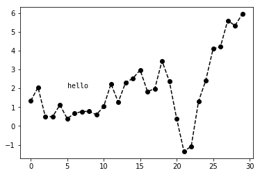
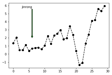
添加注解
|
|
Text(5, 2, 'hello')
|
|
Text(6, 6, 'jinrong')
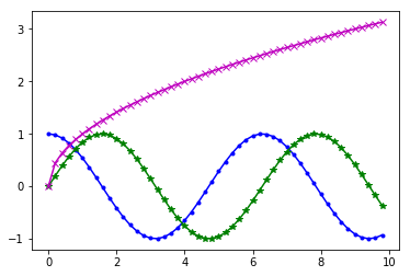
折线图plot
上面的都是以折线图为例子的,看下就OK
|
|
(-1.4500000000000002, 30.45)


(0, 50)
散点图scatter
散点图和折线图的用法相似,基本把plot改成scatter方法
|
|
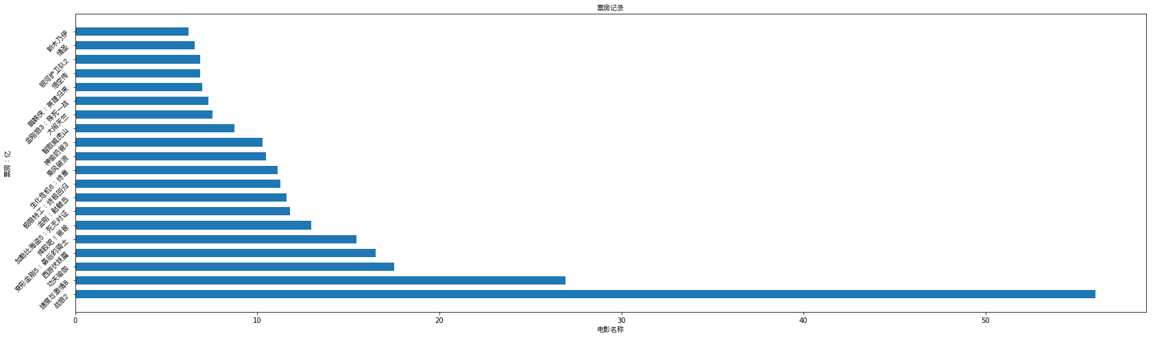
条形图bar(竖着的)、barh(横着的)
|
|
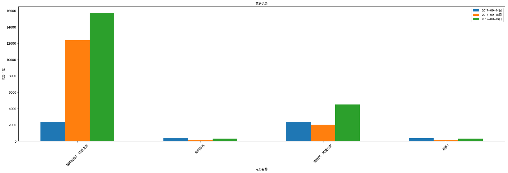
多次条形图
假设你知道了列表a中电影分别在2017-09-14(b_14), 2017-09-15(b_15), 2017-09-16(b_16)三天的票房,为了展示列表中电影本身的票房以及同其他电影的数据对比情况,应该如何更加直观的呈现该数据?
|
|
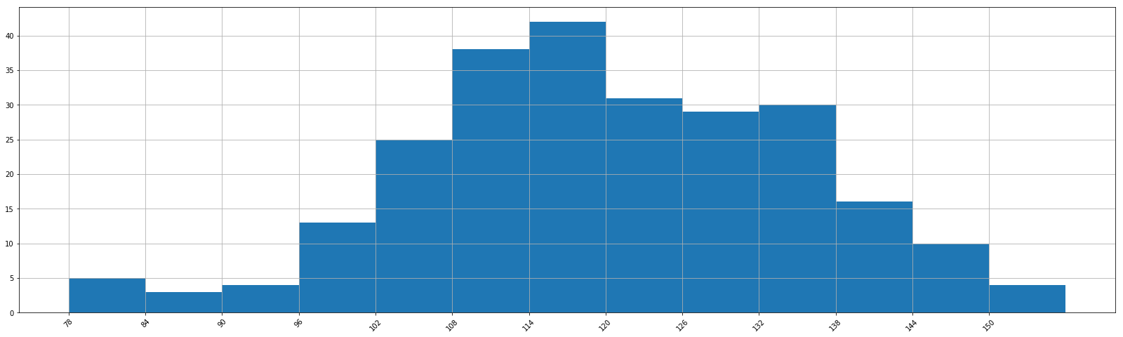
直方图hist
|
|
13 156 78 78
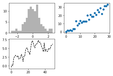
一页创建多张图 subplot
|
|
[<matplotlib.lines.Line2D at 0x8444080>]
|
|
[[<matplotlib.axes._subplots.AxesSubplot object at 0x000000000907BB70>
  <matplotlib.axes._subplots.AxesSubplot object at 0x00000000090A4C50>
  <matplotlib.axes._subplots.AxesSubplot object at 0x00000000090D4208>]
 [<matplotlib.axes._subplots.AxesSubplot object at 0x00000000090F9780>
  <matplotlib.axes._subplots.AxesSubplot object at 0x00000000095A2CF8>
  <matplotlib.axes._subplots.AxesSubplot object at 0x00000000095D32B0>]]
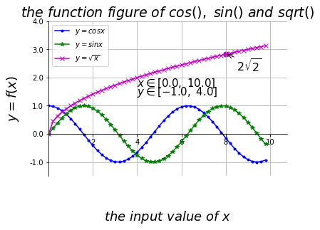
实战
1. 导入包
|
|
2. 准备数据
|
|
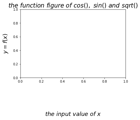
3. 绘制基本曲线
|
|
[<matplotlib.lines.Line2D at 0x8315b00>]
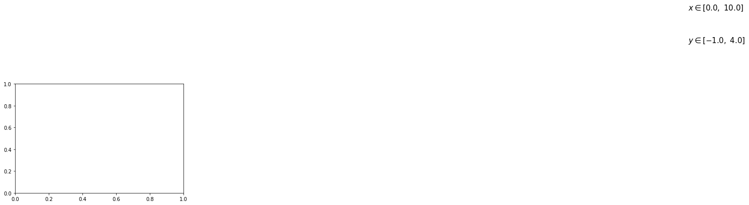
4. 设置坐标轴
|
|
|
|
([<matplotlib.axis.YTick at 0x7f3fb00>,
  <matplotlib.axis.YTick at 0x7f3f438>,
  <matplotlib.axis.YTick at 0x7f5b438>,
  <matplotlib.axis.YTick at 0x8103940>,
  <matplotlib.axis.YTick at 0x8103e48>,
  <matplotlib.axis.YTick at 0x8109390>],
 <a list of 6 Text yticklabel objects>)
|
|
Text(0, 0.5, '$y = f(x)$')
5. 设置文字描述、注解
|
|
Text(4, 1.38, '$y \\in [-1.0, \\ 4.0]$')
|
|
Text(8.5, 2.2, '$2\\sqrt{2}$')

6. 设置图例
|
|
<matplotlib.legend.Legend at 0x9495c88>
7. 网格线开关
|
|
8. 显示
|
|
完整的绘制程序
|
|
参考
|